
Glassmorphism Performance Cost: A Cautionary Tale
Glassmorphism is one of the most seductive design patterns in modern UI.
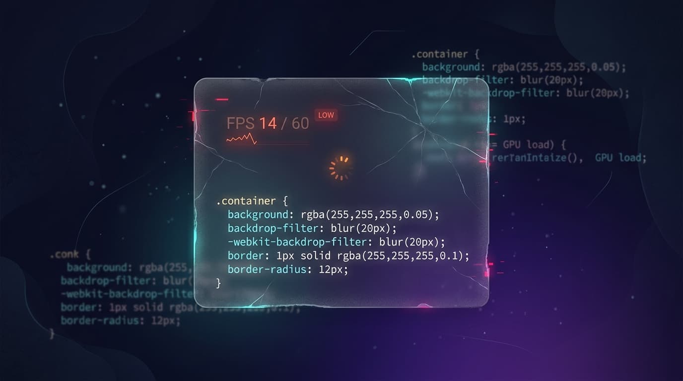
Glassmorphism is one of the most seductive design patterns in modern UI.
I’ve been drawn to it since before I knew it had a name. That frosted, translucent container that borrows the page’s color, holds its own depth, and somehow makes every layout feel like it belongs to a higher tier. It bends to fit almost anything: B2B SaaS dashboards, Web3 platforms, crypto apps, portfolios.
But here’s what nobody tells you upfront: glassmorphism comes with a real performance cost if implemented carelessly.
I ran into this recently while building a landing page with several glassmorphic cards. Everything looked perfect. I matched the design nearly pixel-for-pixel and moved on. Then I deployed it. On desktop, everything felt fine. On mobile, scrolling through the featured section was noticeably sluggish.
Read the rest of this piece on LinkedIn — where it was originally posted.
→CONTINUE READING