
Is AI Slop a Reflection of Our Design Choices?
“AI slop” is becoming the easiest thing to spot and the easiest thing to criticize.
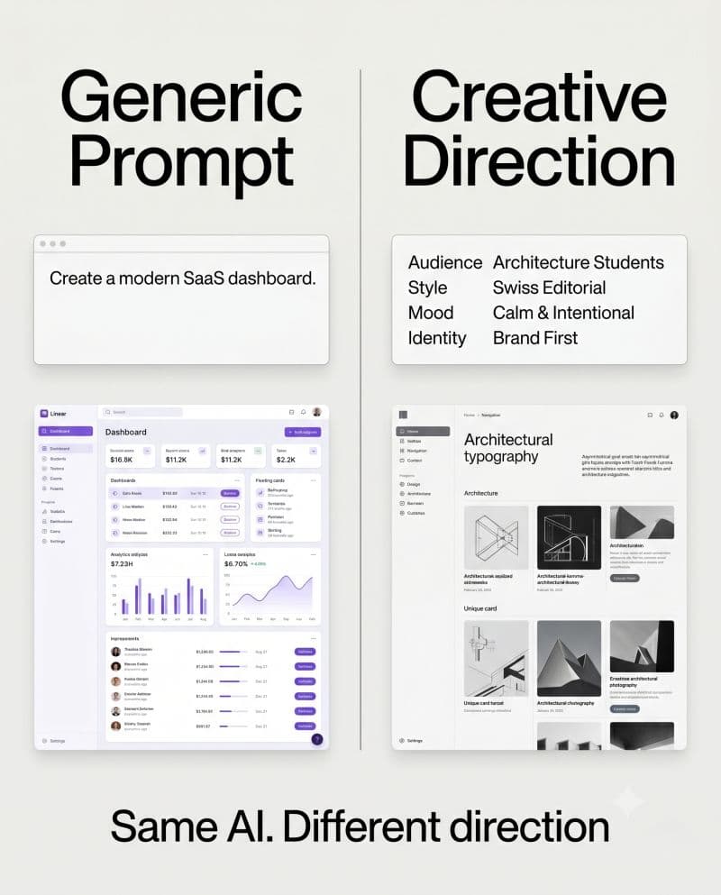
“AI slop” is becoming the easiest thing to spot and the easiest thing to criticize.
Every day on X, Reddit, and countless design communities, the conversation keeps resurfacing: the em-dashes, the generic pill buttons, the soft gradients, the “vibe coded” interfaces that somehow feel familiar before you’ve even interacted with them.
As frontend engineers and UI designers, we all know that feeling when a UI looks technically correct but somehow lacks identity. But here’s the uncomfortable question: are we looking at actual AI slop, or are we simply seeing overused design patterns at scale?
Many of the patterns we criticize today were once considered good design — clean spacing, rounded components, minimal interfaces, friendly typography, accessible visual hierarchy. None of these are inherently bad. The challenge begins when good design becomes default design, and default design becomes indistinguishable from everyone else’s product.
Read the rest of this piece on LinkedIn — where it was originally posted.
→CONTINUE READING